
What a checkout screen costs, and what the research measures
The checkout abandonment numbers everyone quotes, what they were actually measured on, and which reasons a redesign can move.
About this article
Baymard's 70.22 percent cart abandonment figure is an average of 50 studies published between 2006 and 2025, not a live measurement. Its reasons survey puts unexpected extra costs at 40 percent and a long or complicated checkout at 17 percent, and only the second of those is something a checkout redesign controls.
The 60 percent in this page’s address was never a measurement. An earlier version of this post told it as our own story, and it was not one: Voqal has not run a retail checkout, and no funnel of ours produced that figure. The URL stays because it is indexed. The claim does not.
What survives is the question underneath, which is a good one. Most people who reach a checkout do not finish it. The numbers describing that are among the most quoted and least read in commerce, so it is worth going through what they were measured on before deciding what to do about them.
The 70 percent number, read properly#
Baymard Institute maintains the figure everyone cites: an average cart abandonment rate of 70.22 percent. The part that usually falls off in the retelling is the method. It is an average across 50 separate studies published between 2006 and 2025. It is not this year’s rate, not your rate, and not a rate measured on any one population.
That matters for how you use it. As a sanity check on your own dashboard it is fine. As a baseline you are supposedly beating, it is meaningless, because the studies behind it span two decades of different sites, categories and definitions of abandonment.
The device gap is better evidenced and more recent. Contentsquare’s 2026 benchmark, drawn from 99 billion sessions across more than 6,000 sites between Q4 2024 and Q4 2025, found desktop converting 74 percent higher than mobile. Both fell year on year. The surface most of your traffic arrives on is the one that converts worst.
Which reasons a design can actually move#
Baymard also asks people why they left. Excluding respondents who were only browsing, the reasons rank like this: extra costs too high at 40 percent, delivery too slow at 20 percent, distrust of the site with card details at 19 percent, forced account creation at 18 percent, and a checkout that was too long or complicated at 17 percent, tied with site errors. Respondents could give several answers, so the column does not total 100.
Read the ranking and the scope of the design problem becomes clear. The top reason is a pricing and shipping-policy decision. The second is a logistics one. The third is a trust signal built over years. Design owns the fourth and fifth, and the fifth is the one this post is about.
Seventeen percent is a minority share of a large problem. It is also the share you can move this quarter without anyone’s approval, which the reasons above it are not.
The form, measured#
Baymard’s benchmark of the flows themselves found that the average 2024 checkout ran 5.1 steps and asked for 11.3 form fields, where its research says most sites need 8. So the average checkout asks for about three more fields than the task requires.
Step count is the weaker of the two measures. A five-step flow that asks for eight things is a lighter object than a two-step flow that asks for fifteen, and users experience the asking rather than the screen boundaries. If you are choosing what to instrument, instrument what you request from the user rather than how many routes it spans.
The advice that follows is not new and is still right. Offer guest checkout. Support address autofill and the platform wallets. Never block paste in a card field, which also fails WCAG’s accessible authentication criterion when it happens on a login step. Delete fields you do not act on. All of it is incremental, and all of it leaves a form standing.
Where an agent changes the shape#
An in-app agent is a second path to the same operations, for the subset of tasks a user can state in one sentence. Reordering something they have bought before. Changing a delivery slot. Chasing a refund on a specific order. None of these needs a four-screen wizard, and all of them currently get one.
The mechanics are ordinary. The user says what they want, the agent calls the endpoints your app already calls, and the answer comes back as native UI. The part that matters for money is the last step, where the agent draws a single confirm card and waits. Nothing executes before the user accepts it.
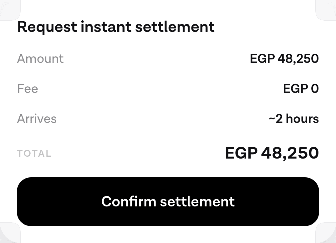
Two honest limits on that. An agent does nothing about the 40 percent who left over shipping costs, because the costs are the problem and hearing them spoken aloud does not improve them. And a first-time purchase with a new address and a new card is not a one-sentence task; it is a form, and it should stay one. The gains are concentrated in repeat actions by users the app already knows, which is also where the reorder case lives.
The confirmation step is the one screen worth keeping#
There is an irony in a post at this address arguing for fewer screens. The confirm step is the screen you should not remove, and the reason is that it is the only place where the user’s intent and the system’s interpretation are both visible at once.
Conversation design has known this for a while. Google’s guidance for voice agents recommends explicit confirmation in the form “You mean x?”, repeating only the part that matters rather than reciting the whole request back. The same guidance suggests raising the no-speech timeout when the user has something in front of them to read, which is exactly the moment a confirm card creates.
On the platform side the primitive already exists. Android’s biometric documentation describes auth-per-use keys, where the user authenticates for each single cryptographic operation rather than for a window of time, and says plainly that they are “useful for high-value transactions, such as making a large payment”. That gives you a tier boundary to design against. A balance check needs no gate. A payment needs one, bound to that one operation.
What to measure instead#
Abandonment rate is a poor operating metric because most of its movement comes from things a product team does not control. Task completion is better: of the people who started this specific thing, how many finished it.
The self-service literature is a useful warning here. Gartner’s August 2024 survey of 5,728 customers found that only 14 percent of service issues were fully resolved through self-service, and that 43 percent of failures happened because people could not find content relevant to their issue. An agent that answers fluently and finishes nothing will look busy in analytics and change no revenue.
What to take from this#
Quote the 70 percent with its method attached, or do not quote it. Treat the reasons ranking as a map of who owns what, and accept that design owns a minority share of it.
Then separate your tasks into the ones that genuinely need structured input and the ones that have been wearing a form because there was nowhere else to put them. The second group is where removing typing from the path pays, and it is smaller than a vendor would like to tell you. There are tasks where voice is the wrong mode entirely, and a checkout in a quiet office with a card in hand is often one of them.
If you want the integration detail, the guide to the whole agent stack walks the whole path, and the widget reference covers what a confirm card can express.
Sources#
- Baymard Institute. 49 Cart Abandonment Rate Statistics. Accessed 12 September 2026.
- Baymard Institute. Checkout Flows Average 5.1 Steps & 11.3 Form Fields. Accessed 12 September 2026.
- Contentsquare. 2026 Digital Experience Benchmark: Conversions. Accessed 12 September 2026.
- W3C. Understanding SC 3.3.8: Accessible Authentication (Minimum), WCAG 2.2. Accessed 12 September 2026.
- Google Cloud. Voice agent design best practices, Dialogflow CX documentation. Accessed 12 September 2026.
- Android Developers. Show a biometric authentication dialog. Accessed 12 September 2026.
- CX Today. Only 1 in 7 Customer Service Queries Resolved With Self-Service, Gartner Study Finds. Gartner survey of 5,728 customers, August 2024. Accessed 12 September 2026.
Next
The catalogue of every widget kind the agent can ask your app to draw, and the payload each one takes.
See what a confirm card isThe rest of Business
Open the clusterBuild versus buy, what an agent changes about activation and support load, and the measurements that tell you before the quarter ends.
- How to add an AI agent to a mobile app: the complete guideWhat an in-app agent is made of, what each of its five pieces costs to own, and the honest path from a first spoken turn to something you can hand to users.12 min
- What typing on a phone actually costs your appPeople type about 36 words a minute on a phone. Here is what the research measures, what it does not, and why the fix is removing the form.8 min
- Using an agent to get a user to first valueOnboarding leaks where people have to type. An agent can collapse setup into one request, and there are four kinds of friction it genuinely cannot touch.8 min
- The metrics that tell you an in-app agent worksSeven numbers worth tracking, what each one hides, and why containment is the one that looks best while telling you least about the feature.9 min
- Conversational commerce numbers that survive checkingWe opened every source behind the statistics people quote about voice and AI shopping. Here is what held up, what did not, and what nobody has measured.10 min
- Build vs buy: what an in-app agent really costs to ownWiring a speech API to a model takes an afternoon. The nine workstreams that turn it into something you can hand to a user do not have an end date.10 min
- The business case for an in-app agent, and its missing numberHow to build an ROI model for an in-app agent when the one input that decides the answer has no public benchmark, and which of the levers you can honestly measure.8 min
- Deflection is the wrong number: measure whether the task finishedA deflection rate scores a user who gave up the same as one who was helped. What Gartner's own self-service figures show, and what to count instead.9 min
- Agents in a travel app: rebooking is the feature worth buildingBooking is already a form. The task an agent is uniquely good at is rebooking under disruption, and it needs four read tools before it can answer anything.8 min
- Agents in a logistics app: the driver's hands are the constraintHands-free is a legal requirement in a cab, not a convenience. What a logistics agent should do, how proof of delivery works spoken, and the offline case.8 min
- An agent in a healthcare app: booking, refills, and the stop lineThe three patient-facing tasks an in-app agent does well, the escalation line that belongs in code, and the compliance question to settle before any of it.9 min
- Agent runtimes for mobile apps: an honest comparison (2026)OpenAI Realtime, LiveKit, ElevenLabs, Vapi and Retell compared on what a mobile team actually chooses between: layer coverage, client SDKs and the write path.8 min
- Where in-app agents are being adopted fastestAdoption is running ahead of the English-speaking world in several large markets. What that means for a team shipping an agent outside its home country.10 min
- What the first week of real assistant traffic teaches youReal users ask for things no test plan contains. Three questions only live traffic answers, and the metric that looks good while telling you nothing.10 min
Elsewhere on the map
- Letting users reorder by voice in three tool callsRepeat purchase is the cheapest first agent feature to ship. Three tools carry it, only one of them writes, and a confirm card sits between the second and the third.Agent basics6 min
- Agents in a shopping app: reorder, track, returnThe three retail tasks worth giving an agent, why reorder is first, and how to check whether your catalogue supports the case at all.Agent basics7 min
- Which agent actions deserve Face ID, and which do notBiometric-gating everything trains users to approve without reading. Tier agent actions by what they can destroy, and let the platform decide how.Safety10 min